
Please take the 2021 Diversity In Email Industry Survey Today Hi! I’m Luke, the editor of Beautiful Email Newsletters and one of the contributors to More

The #1 html email gallery showcase in the world
Note: This article previously appeared in .NET magazine.
Email design and structure is an art. They're single webpages designed to remind the user that a company or organisation exists, or ask the reader to take a specific action. When done right, subscribers love receiving your newsletters. When done wrong, newsletters get dumped into the spam folder and future messages will never be seen.
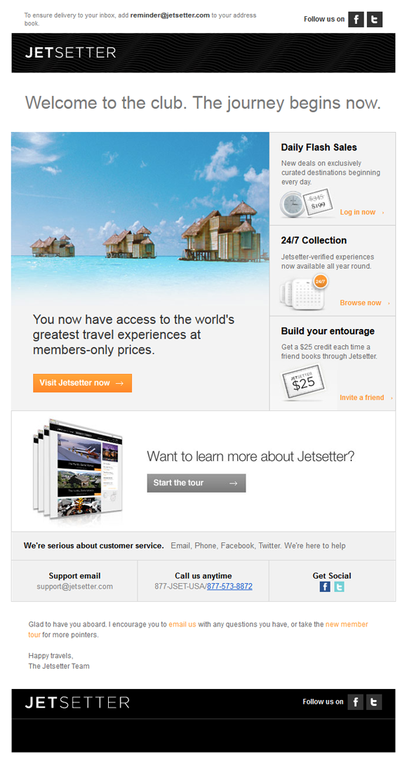
There is always a bit of risk and uncertainty when a subscriber first signs up to your email or service. They hold their breath as they click 'sign-up' and slowly exhale when the first email comes in and it’s revealed that you will not be spamming them with all kinds of junk. The Jetsetter welcome email has a lot of new users slowly exhaling and relaxing when it first comes in. Clean, clear design presents a comprehensive overview of their service, benefits and options available to you as their user. This is an email designed to be kept and referenced. It is almost a user account screen or service dashboard designed for your inbox.
After first contact you are now into regular weekly or monthly communication. This is where you need to deliver real value on a regular basis. Of course it helps to look great when doing it.
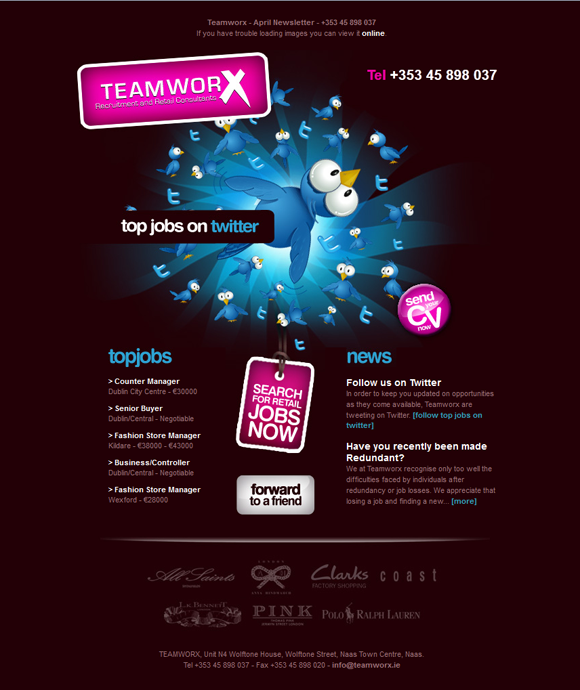
TeamWorx is an email with a list of the latest jobs in retail. The great, strong design of the email will leave you in no doubt as to who found you your next job.
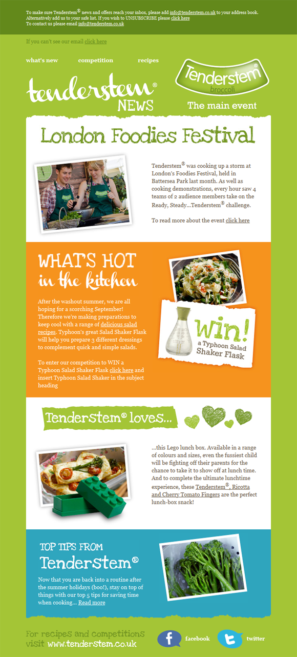
This is a newsletter about broccoli. Yes you read that right, broccoli! They're doing something right if they manage to get me looking twice at the ‘green stuff’. Tenderstem, wisely, don't give their product the hard sell – instead, they plug into the whole foodie culture. And who doesn't like reading about delicious food and drooling at gorgeous photos of the dishes?
The design is bright and fresh, as expected, but also brings in a bit of personality and nature with the loose font and rough edges. A really lovely design. Mmm, I am hungry now.
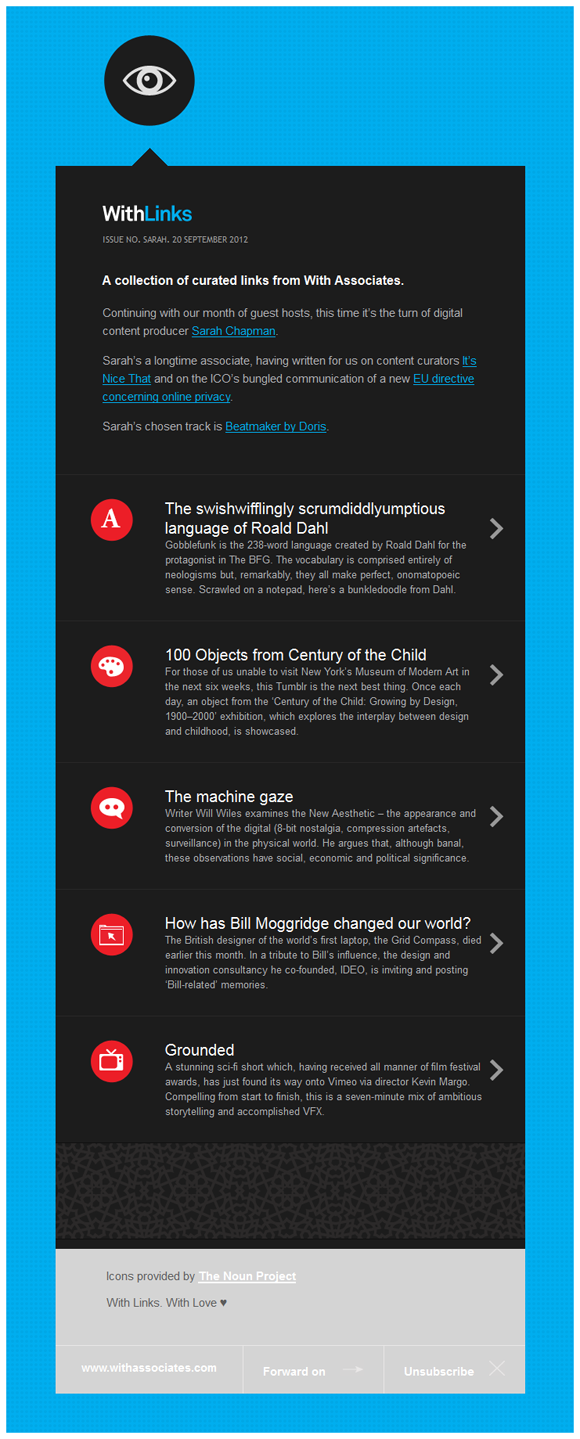
Instead of looking at how you can design your email newsletter, why not look at the very concept of what an agency newsletter should be. Digital agency With Associates haven't taken the traditional route of showcasing the great projects and clients they work with every month. Instead, they've turned it into a publication in itself.
WithLinks is a curated list of the most interesting content on the web and turns With Associates into thought leaders, better and faster than any screenshots or impressive client list could.
Better still, guest curators and content you do not create yourself can dramatically cut down your marketing workload.
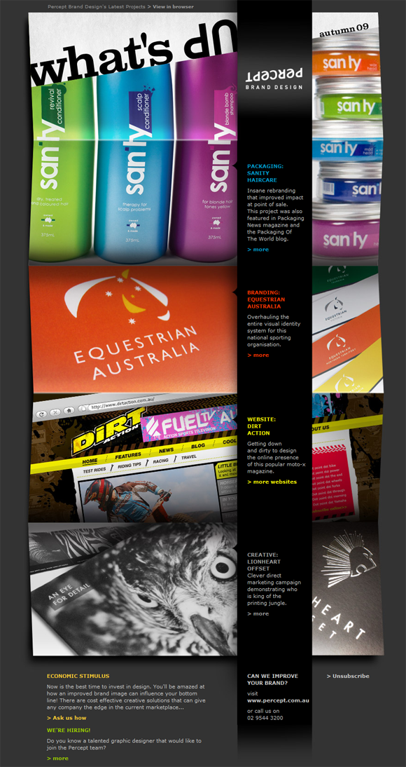
From one extreme of almost no images to a newsletter made almost entirely of images – the contrast cannot be more extreme. Percept have turned the presentation of client projects into a design piece.
This is an approach that has worked very well, as their newsletter has been shared extensively and featured in email design collections all over the web for the last few years.
They were still wise enough to keep the text portion of the email as HTML so it can be read when images are turned off. Something all email designers should remember.
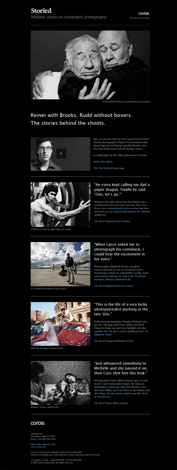
The creators of Storied from stock image agency Corbis understand the power of faces. Of course it helps that they have access to some of the most famous ones. We are all drawn to faces. It is an inbuilt response that you can take advantage of in your designs. Add to that the power of stories, and you have a winning email newsletter. The design is simple but very classy-looking in black and white. Again, a newsletter I look forward to getting and reading every month.
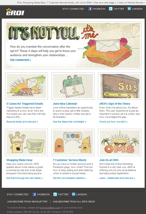
Eroi go to great lengths every month in customising the style and illustration of their emails. The always interesting and focused content keeps you engaged and coming back for more.
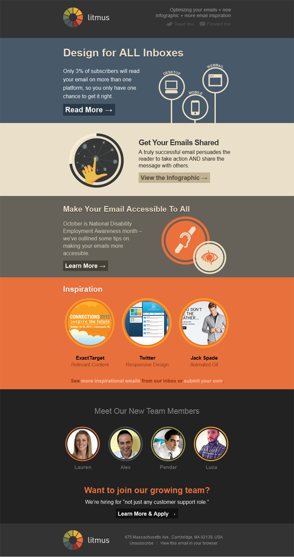
Litmus just recently launched a new look for their email newsletter. When you're operating a business in the email space the pressure is on to make your email look good. And good it looks, broken into clear bands of colour and sections to highlight and differentiate aspects of their business and product.
One thing becomes abundantly clear in ecommerce emails. It's nearly all about the product shot, a goal made more challenging by the fact that most email clients hide images by default.
Some newsletter designers trust that you will want to turn images on if you are interested in the brand, an approach that makes sense as the user subscribed to receive the emails in the first place. Other brands leave less to chance and put descriptive alt text with images to tempt you to turn them on.
Of all the email types, ecommerce ones play more often with size and formats as they try to push conversion and stand out from the crowd. Horizontal scrolling, animated emails, interesting alt text, anything to grab your attention.
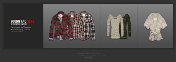
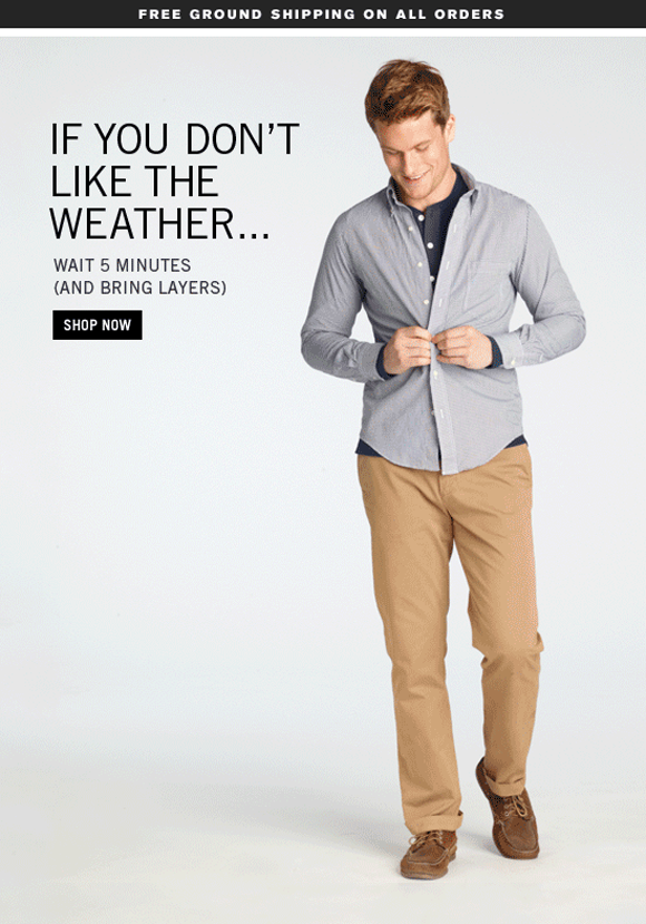
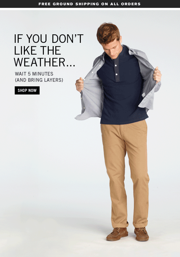
This one focuses on the clothes themselves and produces great product shots where you can almost feel the texture of the cloth. They have a very solid, natural feel. The fun each month is how interesting they can make the layout of those clothes. Stylistically, they keep each email consistent so you are in no doubt, at a glance, who this email is from. Dark blacks and grey backgrounds really makes the colourful products stand out.
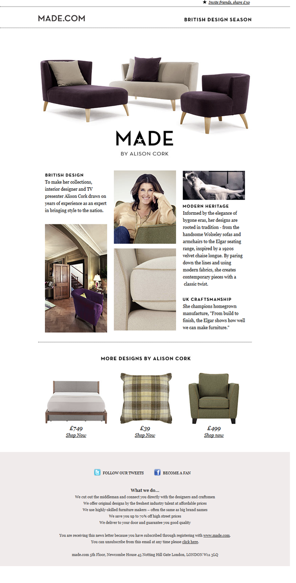
Made make their furnishings part of the design and give their products a huge amount of whitespace to make them stand out. Notice how they also ‘interior decorate’ their emails. All the featured products colour coordinate where you could almost buy the entire set for your room. Lovely touch.
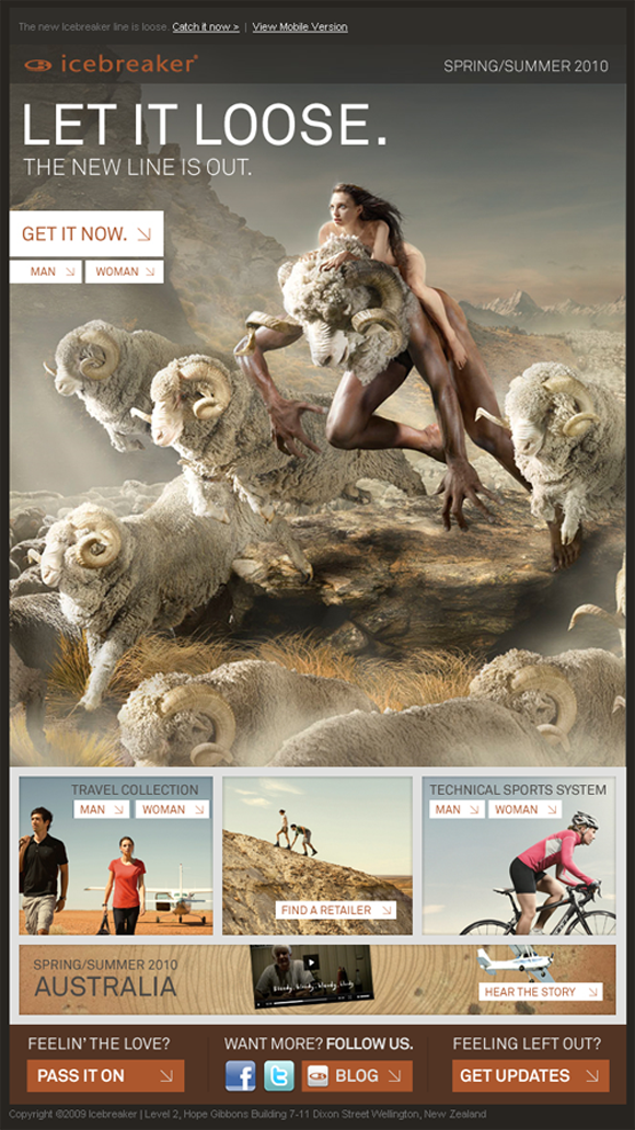
Fantasy imagery is nothing new in fashion and sports, but you rarely see it brought so far and looking so rich as in this campaign from Icebreaker. It is very much aspirational/lifestyle design.
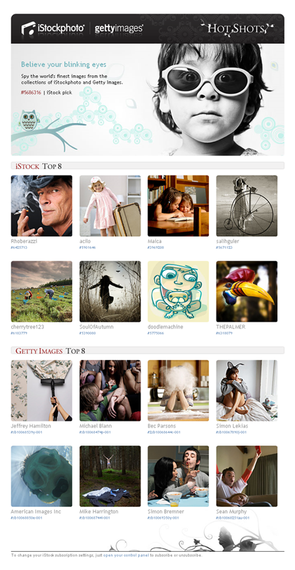
If you are lucky enough to have a hugely visual product, sometimes it is best to let your images do the talking as is done in this mail from iStockPhoto. For designers and photographers the mail works as both a source of visual inspiration and a showcase of their products. Just like With Associates, iStockPhoto are curating the best of the best from their vast image collection.
If there is one technique that ecommerce stores have really played with and embraced this year it’s animation. Animated gifs are becoming cool again and finding new life in email newsletters.
This campaign from Jack Spade is a nice example, showing the model in different poses and clothes when opened. File size can become an issue with animated gifs especially if they're as large as the ones used in this email, which comes in at about 700k.
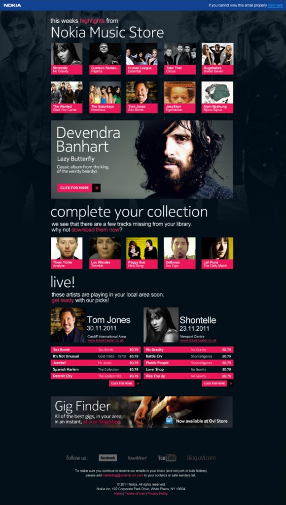
While the Nokia Ovi store was closing, this great email for their music store began the transition over to the Microsoft Windows style.
Again, it's curating the new releases that are available to discover. Of all the ecommerce examples it's great to see such obvious personalisation of the email to the subscribers own music taste and their collection. For example, the “Complete your collection” section is based on what is missing from your own music and the “Live gigs” section shows gigs from artists in the subscriber's play list.
One purpose, one event, and (hopefully) one call to action. Invitation emails are often an excuse for designers and marketers to let their hair down, go off the standard style guide and push the boundaries. What's interesting in all these designs is how few colours they use to make a more punchy design.
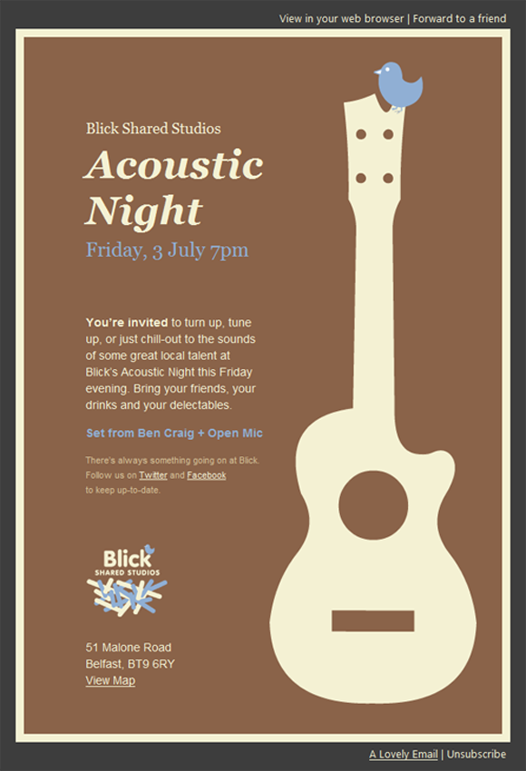
Lovely two-tone colour design for this invite to a music night at a local venue. It makes the assumption that you know the venue, which is fair enough. So the three key pieces of information are prioritised: music, music type and time. The rest is detail.
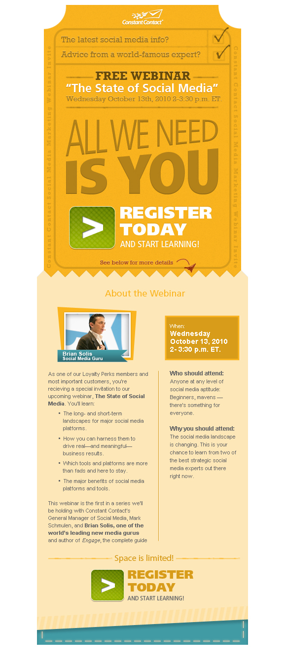
The Blick acoustic invitation is in stark contrast to this really vibrant campaign from Constant Contact for a webinar. It contains not one, but two strong calls to action. The email manages to break the message into two parts. The first gives the key points and a register button. The second gives a more detailed breakdown of the webinar and its benefits, and again a call to action. Great use of colour and typography to give a strong, clear message.
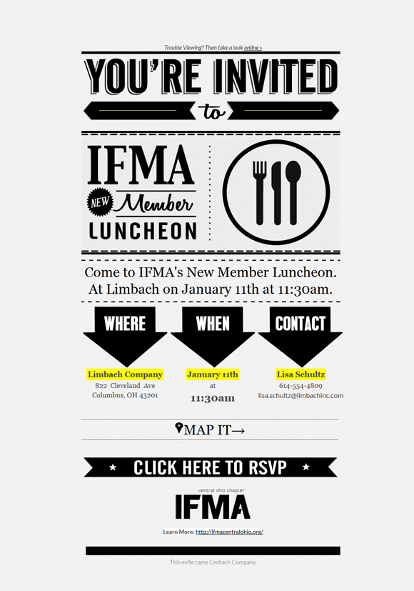
Sometimes following a style too closely can undermine your campaign. The retro typography based design for the IFMA Member Luncheon is lovely. Stark black and white really pops off the screen.
Strangely, while they do add a colour highlight to When, Where and How, the most important button, “Click here to RSVP”, gets lost. A colour on this button would finish it off nicely.
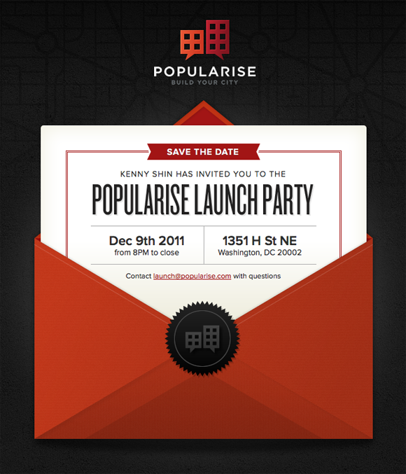
A literal interpretation of an invitation is rendered beautifully in this design for Popularise. I really like how they incorporated the logo into the letter seal. No design element is wasted and everything supports the brand and message.
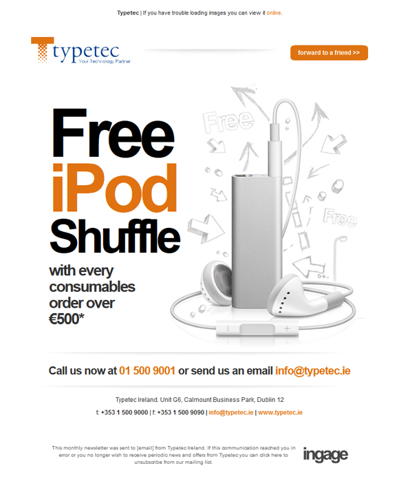
I am a big fan of the Ronseal model: it does exactly what it says on the tin. This sales campaign from Typetec does that. In big bold letters. Beautiful, bold and simple.
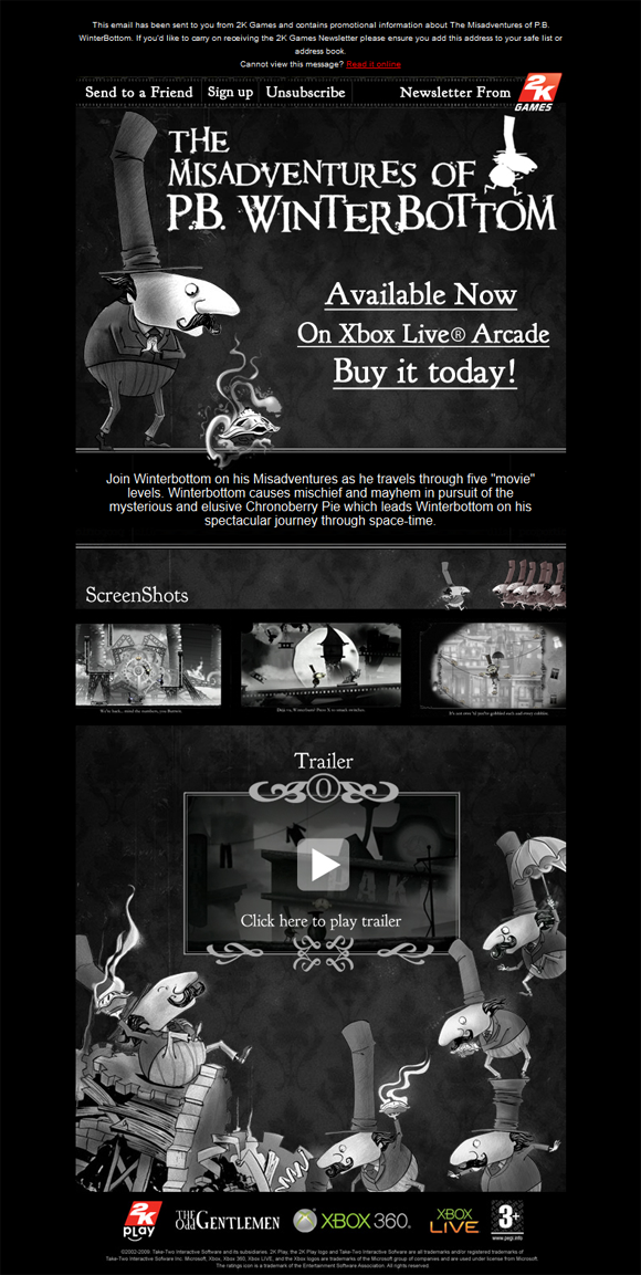
This email for the launch of the game immediately pulls you into the atmospheric black and white world of P.B Winterbottom. It’s the beautiful illustration that buys your interest and keeps you reading. While embedding a video is only possible on some email clients such as Gmail and Apple mail, you can still fake it with a screenshot and play button. Video has been shown to increase conversion and this is especially true for a game where you need to show gameplay in action.
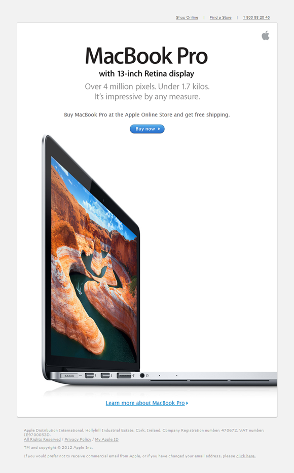
Apple are masters of the beautiful product shot and their latest campaign for the launch of the Macbook Pro is no different. The image manages to show off the amazing slim design and clarity of the screen, even from extreme angles. Only Apple could get away with such a small 'buy now' button!
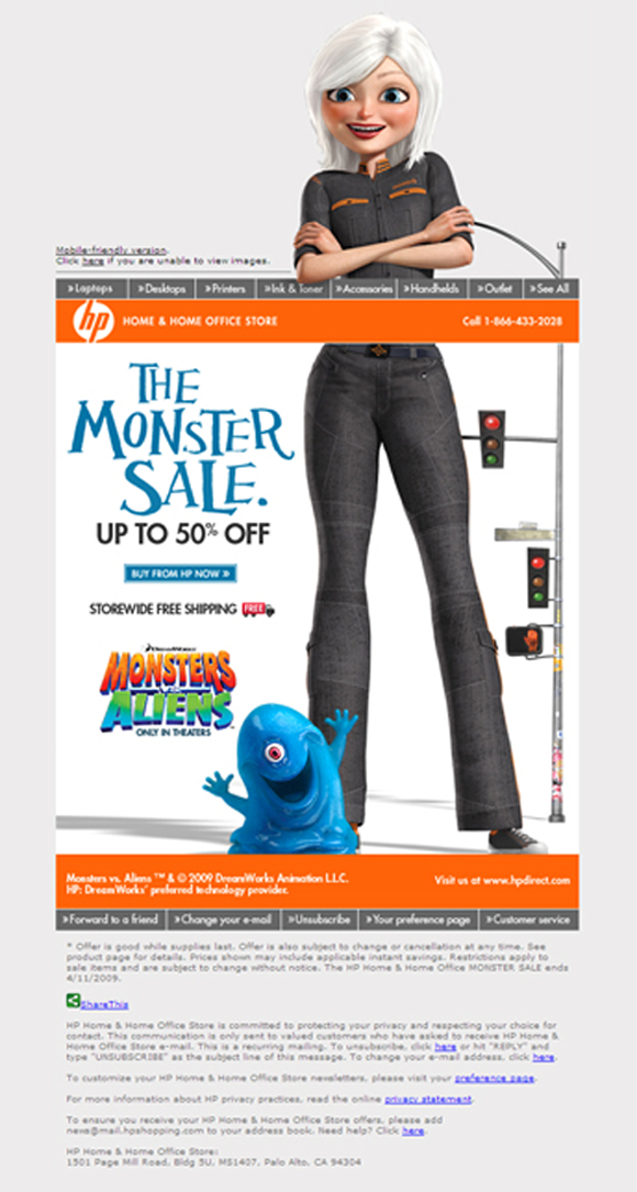
An oldie but a goodie. I'm a sucker for a design that breaks its bounds and the tie-in with Monsters vs Aliens gives HP a great excuse to do just that, by cutting the giant woman in half for a half price monster sale.
This one does a great job of playing with the email format to show you the water slide experience using your scroll bar. I might be worried about how long this would take to load, but what a great experience when it does.

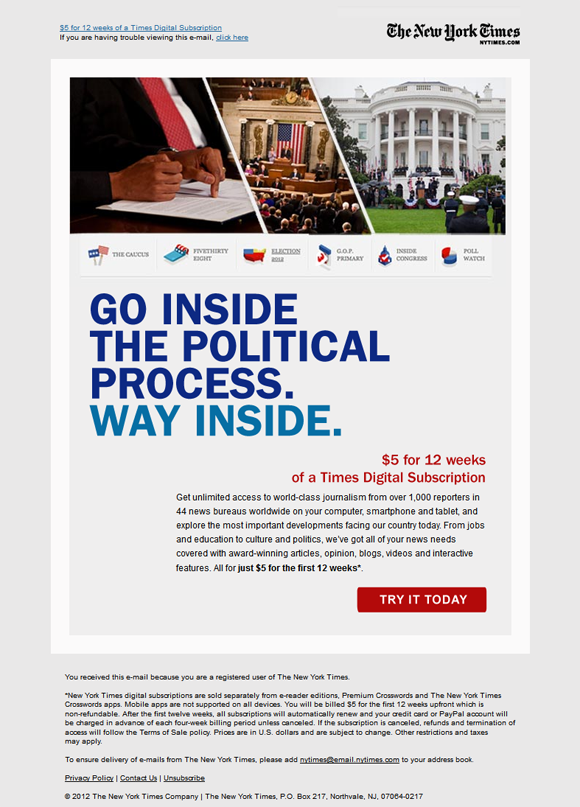
The New York Times targeted interest in the presidential campaign for this email, which is really a brilliantly-targeted offer for a paid trial – $5 for a Times subscription for the duration of the election run. Nothing flashy here. Clear value statement, price and call to action.
If you enjoyed this, please share it with your network!
Get the latest blog posts and book chapters in your inbox.

Bafta nominated designer of over 10 years, Alan O’Rourke is Product Marketing Manager at WhatClinic.com, founder of email newsletter service Toddle.com and runs the number one email showcase site Beautiful-email-newsletters.com


Please take the 2021 Diversity In Email Industry Survey Today Hi! I’m Luke, the editor of Beautiful Email Newsletters and one of the contributors to More